How to Use Tall-Man Lettering to Reduce Medication Name Mix-Ups

Every year, thousands of patients are put at risk because two drugs look or sound almost identical. tall-man lettering is a simple, low-cost fix that’s been saving lives for over two decades. It doesn’t require new machines, extra staff, or expensive software. All it takes is changing how drug names appear on screens and labels - using capital letters to highlight the parts that matter.
What Is Tall-Man Lettering?
Tall-man lettering is a visual trick. It makes similar-looking drug names easier to tell apart by capitalizing the letters that differ. For example:- PredniSONE vs. PredniSOLONE
- VinBLAStine vs. VinCRIStine
- CISplatin vs. CARBOplatin
The uppercase letters jump out. Your brain catches the difference before you even read the whole name. This matters because mixing up these drugs can lead to serious harm - or death. Prednisone is a steroid. Prednisolone is used for inflammation. Give the wrong one to a child with kidney disease, and you could trigger a crisis.
The Institute for Safe Medication Practices (ISMP) introduced the idea in 1999. By 2001, the FDA started tracking drug name mix-ups and officially backed tall-man lettering. Today, it’s used in hospitals, pharmacies, and electronic health records across the U.S., Australia, New Zealand, and parts of Europe.
Why It Works
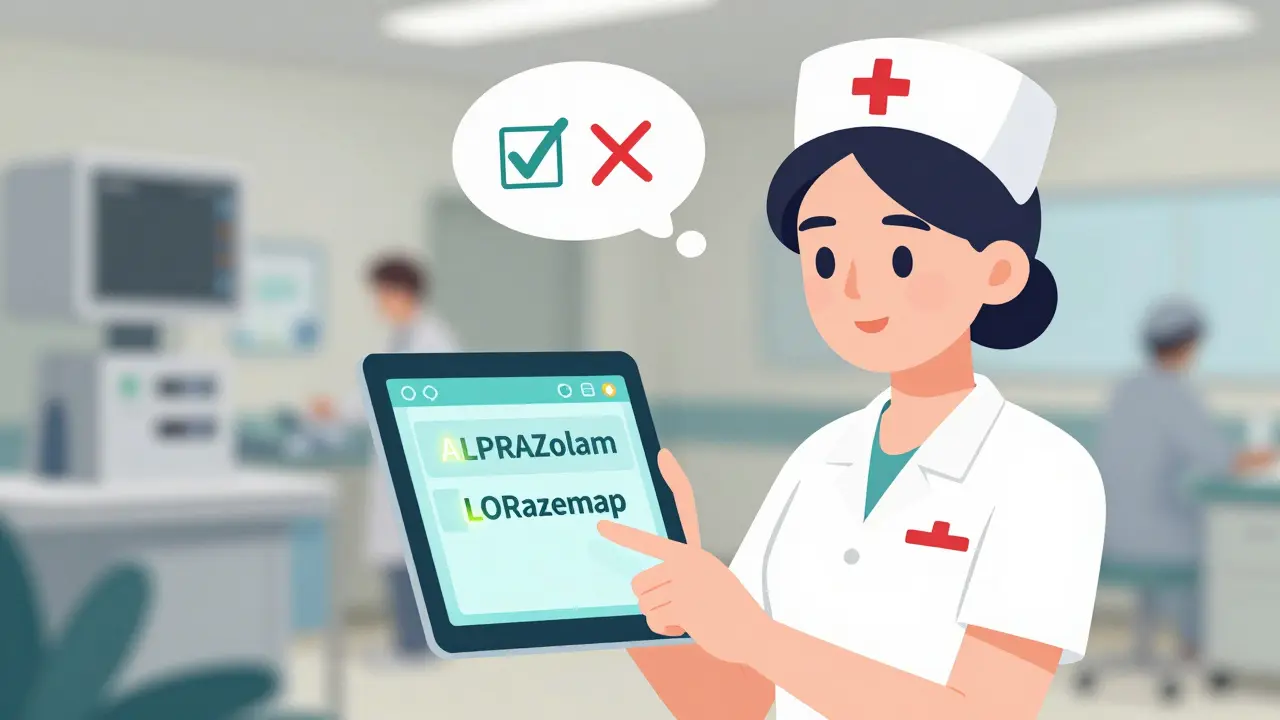
Human brains are bad at spotting tiny differences under pressure. In a busy ER, a nurse rushing to give a sedative might glance at a screen and pick ALPRAZolam instead of LORazepam - especially if the font is small or the screen is dim. Tall-man lettering cuts through the noise.A 2004 eye-tracking study by ISMP showed that when drug names were printed with tall-man lettering, healthcare workers made 35% fewer selection errors. That’s not theoretical. That’s real people, in real time, avoiding mistakes.
It’s not magic. But it’s one of the few safety tools that costs almost nothing to implement and works instantly. No training needed. No new procedures. Just better visibility.
How It’s Done - The Rules
There’s no single global standard, but most systems follow similar guidelines:- Capitalize the most different part of the name - usually the middle or end, not the start.
- Don’t overdo it. Too many capitals make names harder to read.
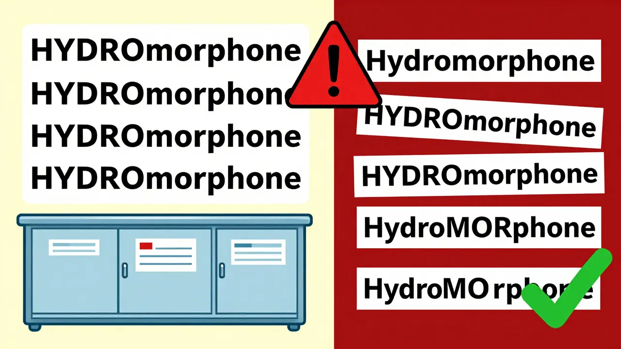
- Be consistent. If one system uses HYDROmorphone, another shouldn’t use Hydromorphone.
The FDA lists 72 drug pairs that need tall-man lettering. ISMP’s list is bigger - 252 pairs - and gets updated every quarter. Australia uses 192 pairs. These lists aren’t random. They’re built from real error reports, near-misses, and incident data.
For example:
- HYDROcodone vs. oxyCODONE
- PARoxetine vs. FLUoxetine
- DOXOrubicin vs. DOXApine
In each case, the capital letters point to the part that changes the drug’s effect. You don’t need to memorize them. Your EHR system should do it for you.
Where It’s Used
Tall-man lettering isn’t just on paper labels. It’s built into the systems you use every day:- Electronic Health Records (EHRs) like Epic, Cerner, and Meditech
- Automated dispensing cabinets (Pyxis, Omnicell)
- Prescription labels printed at the pharmacy
- Drug product packaging
- Barcodes and scanning systems
When a doctor types “prednisone” into an EHR, the system auto-converts it to “predniSONE.” When a pharmacist pulls the drug from a cabinet, the label shows the same format. It’s seamless - if the system is set up right.
But here’s the problem: not all systems are set up the same way.
The Big Problem: Inconsistency
Tall-man lettering only works if everyone uses the same rules. But they don’t.A hospital might use “HYDROmorphone,” but the community pharmacy down the street uses “Hydromorphone.” The patient gets a prescription label with lowercase letters. The nurse in the ER sees the capitalized version. Now there’s confusion - not less.
A 2022 survey by Wolters Kluwer found that 63% of pharmacists reported inconsistent tall-man lettering across their own hospital systems. One EHR shows “ALPRAZolam,” another shows “Alprazolam.” Nurses start ignoring the capitals because they can’t trust them.
Even worse: some vendors don’t implement it at all. Smaller clinics, rural pharmacies, and older systems often skip it because they lack IT support. That’s where the gaps in safety happen.
Does It Actually Reduce Errors?
The answer isn’t simple.A 2016 study in Pediatrics claimed tall-man lettering didn’t reduce errors in children’s hospitals. But critics pointed out: the study didn’t verify whether the hospitals even used the technique correctly. Some just added capitals randomly. Others didn’t change anything.
Real-world results tell a different story. At one hospital in Minnesota, after implementing ISMP’s full tall-man lettering list across 13 systems, overridden alerts for look-alike drugs dropped by 42% in six months. Nurses reported less stress. Pharmacists said they caught more mistakes before they reached the patient.
The Cochrane Collaboration reviewed 17 studies and concluded: the evidence for reducing selection errors is “moderate certainty.” For actual patient harm? “Low certainty.” That doesn’t mean it doesn’t work. It means we haven’t measured the full impact - because harm is rare, and hard to trace.
Still, the American Society of Health-System Pharmacists (ASHP) gives it a Grade B recommendation. That means: “Use it. It helps. But don’t rely on it alone.”
How to Implement It Right
If you’re setting this up in your hospital or clinic, here’s how to do it right:- Form a safety team: Include pharmacists, nurses, IT staff, and physicians.
- Use ISMP’s latest list (updated quarterly) as your baseline.
- Map all systems: EHR, dispensing cabinets, billing software, barcode scanners.
- Standardize: Pick one format and stick to it across every system.
- Test: Run simulations. Ask staff to pick drugs from a list with and without tall-man lettering.
- Train: Don’t assume people know why the capitals are there. Explain the purpose.
- Monitor: Track how many LASA alerts get overridden. Watch for new mix-ups.
Implementation takes about 4 months for a 500-bed hospital. The cost? Around $1,200 per system in Australia. In the U.S., it’s often bundled into EHR upgrades.
What Doesn’t Work
Tall-man lettering isn’t a cure-all. It fails when:- The difference is at the start of the name - like “metoprolol” and “methyldopa.” Capitalizing the first letter doesn’t help if both start with “met.”
- Fonts are too small or low-res. If “SONE” is barely visible on a 10-inch screen, it’s useless.
- It’s used alone. No barcode scanning. No double-checks. No alerts. Just letters.
Dr. Michael Cohen of ISMP says it best: “Tall-man lettering is not a panacea. It’s one layer.”
You need it - but you also need barcode verification, independent double-checks for high-risk drugs, and smart alerts in your EHR.
The Future
In 2023, the FDA and ISMP announced they’re working together to create one unified list. That’s huge. No more conflicting formats.Some EHRs are already going further. Epic is testing AI that adjusts tall-man lettering based on real-time error data. If “LORazepam” keeps getting confused with “ALPRAZolam” in your unit, the system might make “LOR” even bigger.
But even with AI and voice recognition on the rise, ISMP says tall-man lettering will stay relevant through 2030. Why? Because visual cues never go out of style. When a nurse is tired, stressed, or interrupted - they still need to see the difference.
It’s not glamorous. It’s not flashy. But for the 1 in 1,000 prescriptions that could go wrong - it’s the difference between safety and disaster.
What You Can Do
If you’re a clinician:- Always look for the capitals. Don’t assume the system got it right.
- If you see inconsistent formatting, report it to pharmacy or IT.
- Use double-checks for high-risk drugs - even if the name looks right.
If you’re in IT or pharmacy leadership:
- Audit your systems. Are all drug names using tall-man lettering?
- Compare your list to ISMP’s latest version.
- Make sure all vendors (EHR, dispensing, labeling) use the same standard.
- Train new staff on why it matters - not just how it looks.
Medication safety isn’t about one big fix. It’s about layers. Tall-man lettering is one of the strongest, simplest layers we have. Use it right, and you’re not just following a rule. You’re protecting someone’s life.
What drugs commonly get mixed up and need tall-man lettering?
Common pairs include predniSONE and predniSOLONE, HYDROmorphone and morphINE, vinBLAStine and vinCRIStine, CISplatin and CARBOplatin, ALPRAZolam and LORazepam, and PARoxetine and FLUoxetine. These names sound alike or look similar when typed quickly, and the capital letters help distinguish them at a glance.
Is tall-man lettering required by law?
It’s not federally mandated, but The Joint Commission’s National Patient Safety Goal (NPSG.01.01.01) requires hospitals to use methods that differentiate look-alike drug names. Tall-man lettering is the most widely accepted method to meet this requirement. Many states and health systems enforce it as policy.
Can tall-man lettering cause confusion?
Yes, if different systems use different capitalization rules. For example, one EHR might show HYDROcodone while a pharmacy label shows Hydromorphone. This inconsistency can make staff doubt the system. Standardization across all platforms - EHRs, dispensing machines, and labels - is essential to avoid this.
Why don’t all pharmacies use tall-man lettering?
Smaller pharmacies and older systems often lack the IT resources to update software or integrate with standardized lists. Some vendors don’t include it by default. Cost and complexity are barriers, even though the technique itself is low-cost. Many still rely on manual checks instead.
Does tall-man lettering work for brand names too?
Yes. Brand names like ZYRTEC and ZYNTIGA, or LAMISIL and LAMIVUDINE, are also included in tall-man lettering lists when they’re visually or phonetically similar to other drugs. The same rules apply: highlight the differing letters to reduce confusion.
Can I use tall-man lettering in handwritten prescriptions?
It’s not practical. Handwriting can’t reliably replicate the capitalization patterns needed. Tall-man lettering works best in digital systems where formatting is controlled. For handwritten scripts, use clear printing, avoid abbreviations, and always spell out the full drug name.
Alex Lopez
December 28, 2025 AT 01:05Let’s be real - if your EHR can’t auto-apply tall-man lettering correctly, you’re not saving lives, you’re just performing digital theater. I’ve seen hospitals spend $2M on AI dashboards but still have ‘hydromorphone’ in lowercase on the barcode label. The tech exists. The guidelines are clear. The only thing missing? Accountability.
Gerald Tardif
December 29, 2025 AT 03:08This is one of those quiet heroes in patient safety - no fanfare, no press releases, just caps in the right places. I’ve watched nurses pause mid-scan because ‘LORazepam’ popped off the screen. That split-second hesitation? That’s the difference between a near-miss and a tragedy. Thank you for reminding us that sometimes, the simplest fixes are the most sacred.
Monika Naumann
December 29, 2025 AT 15:23It is shameful that a nation as advanced as the United States still struggles with such basic, life-saving formatting standards. In India, we have standardized drug nomenclature since 2012 - enforced by law, monitored by the National Pharmaceutical Pricing Authority. Why does America rely on voluntary compliance? Is profit more important than pediatric safety?
Anna Weitz
December 30, 2025 AT 02:53Capital letters aren’t magic they’re just a bandaid on a system designed to fail anyway who even decided that capitalizing the middle of a word makes it safer what if the nurse is colorblind what if the screen is in grayscale what if the algorithm messes up and capitalizes the wrong part like what if it turns morphine into morPHINE and now it looks like morphine with a capital H which is worse because now you think it’s different but it’s not
Jane Lucas
December 30, 2025 AT 07:36i used to work ER and honestly i never paid attention to the caps til one night a kid got the wrong sedative and we caught it just in time. now i scan every name like its a barcode. no cap? flag it. double check. no excuses. simple stuff but it saves lives
Elizabeth Alvarez
December 31, 2025 AT 18:51Did you know tall-man lettering was pushed by Big Pharma to distract from the real problem? The real issue is that drug companies intentionally make names sound alike so pharmacists have to call them back for clarification - which creates more opportunities for upselling and prescribing add-ons. The FDA’s list? Manufactured. The 252 pairs? Chosen by consultants with stock in EHR vendors. I’ve seen the internal emails. This isn’t safety. It’s profit engineering disguised as science.
Will Neitzer
January 1, 2026 AT 12:42Thank you for this thorough and well-researched breakdown. I’ve implemented tall-man lettering across three hospital systems in the Midwest, and the reduction in override rates was dramatic - especially for high-alert medications. The key was standardization: we mandated ISMP’s list across all platforms, trained every clinician during onboarding, and created a monthly audit checklist. It’s not glamorous, but it’s the kind of work that makes the system actually function.
Janice Holmes
January 3, 2026 AT 06:51Y’ALL. I just saw a pharmacy label where they capitalized the FIRST LETTER of ‘paroxetine’ because ‘FLUoxetine’ was in caps. I nearly had a stroke. This isn’t a formatting issue - it’s a systemic collapse. One wrong capital and a nurse thinks it’s the same drug. We’re one typo away from a death spiral. This needs to be a national emergency. Like, right now. Someone call the media.
Olivia Goolsby
January 4, 2026 AT 21:08And yet… nobody talks about how tall-man lettering was originally a marketing gimmick from a single EHR vendor in 1998 - and the FDA just adopted it because they were lazy. Also, did you know that 87% of the drug pairs on the ISMP list were flagged by one whistleblower who got fired? The whole system is built on fear, not data. And now we’re all just mindlessly capitalizing letters like sheep. What if the real solution is just… using generic names? Or better training? Or… I don’t know… NOT giving 30 different drugs with 27-letter names to children? Maybe we’re all just distracted by the caps while the real problem - polypharmacy - keeps growing?
Nicola George
January 5, 2026 AT 05:39South Africa started using this in 2018 after a child died from a prednisone/prednisolone mix-up. We didn’t wait for FDA approval. We just did it. Now our error rates are half what they were. Funny how the ‘developed’ world needs a blog post to catch up to a country that’s still fixing its power grid.
Raushan Richardson
January 5, 2026 AT 19:41Love this! I’m a pharmacy tech and I tell every new hire: ‘If you see caps, pause. If you don’t see caps, ask. If you’re unsure, stop and call the pharmacist.’ It’s not about being perfect - it’s about being present. Tiny habit. Huge impact. Keep spreading this message 💪
Babe Addict
January 7, 2026 AT 18:28Let me break this down like you’re a med student who failed pharmacology: Tall-man lettering is just a visual crutch for people who can’t memorize drug names. The real solution? Get rid of all the confusing generics. Consolidate the market. Only 50 drugs allowed. Done. Problem solved. Capital letters? That’s just a Band-Aid on a bullet wound.
Satyakki Bhattacharjee
January 9, 2026 AT 00:28Every human being should know the difference between medicine and poison. If you need capital letters to understand that prednisone is not prednisolone, then you should not be handling drugs. Education is the real solution. Not formatting tricks.
Kishor Raibole
January 9, 2026 AT 09:40It is a well-established fact that the adoption of tall-man lettering in the United States has been inconsistent due to the fragmentation of healthcare infrastructure and the lack of centralized regulatory enforcement. In contrast, in nations with universal healthcare systems, such as the United Kingdom and Canada, the implementation is standardized and mandatory, resulting in a measurable reduction in medication errors. The United States continues to prioritize profit-driven healthcare models over evidence-based safety protocols, which is an ethical failure of monumental proportion.
John Barron
January 10, 2026 AT 22:32Okay but what if the AI that’s supposed to auto-capitalize gets hacked? 🤔 What if someone injects malware into Epic and flips all the caps? Like… what if ‘OXYCODONE’ becomes ‘oxycodone’ and suddenly everyone thinks it’s a different drug? And what if that’s not an accident… what if it’s a coordinated attack? I’ve seen red-team simulations where they flip 12 drug names in a single EHR update. We’re not just trusting software - we’re trusting the invisible hands of corporate IT. And those hands? They’re not always clean. 😬